Label Analysis
In this section, you can read:
(Part 1) Predefined labels- purpose and usage
(Part 2) Analyse labels
Part 1: Create predefined labels
To make both the analysis in MyHume and labelling in the HUME app easier, we introduced predefined labels. This simplifies the process into four steps:
The behaviour specialist, together with the team, decides on the important signal behaviours, daily activities or planned interventions they want to monitor.
These are translated into short, actionable, predefined labels in MyHume.
The caregiver can then select these labels with one tap during the workday after they occur (we do not recommend labelling at the start of the activity).
Later, the labels appear grouped in the charts in MyHume, clearly showing stress levels before, during, and after the event.
1. | Create short, actionable, predefined labels to track signal behaviour or planned interventions from the button “Add label“ on the bottom card of the Label Analysis section. .gif?inst-v=174e8e58-dac9-4992-879c-00705ffc81b9) |
2 | Edit predefined labels from the “Edit button“ on the right. 👉If you research question changes or you adjust your interventions, you can edit the field. .gif?inst-v=174e8e58-dac9-4992-879c-00705ffc81b9) |
3. | Delete irrelevant or outdated predefined labels from the “Remove” option on the right. 👉 Already applied labels will remain stored and can be analysed later. This action only removes the label from the Hume app, so it can no longer be applied in the future. .gif?inst-v=174e8e58-dac9-4992-879c-00705ffc81b9) |
Example | Below is an example of how the predefined labels appear in the Hume app from the caregiver’s view. 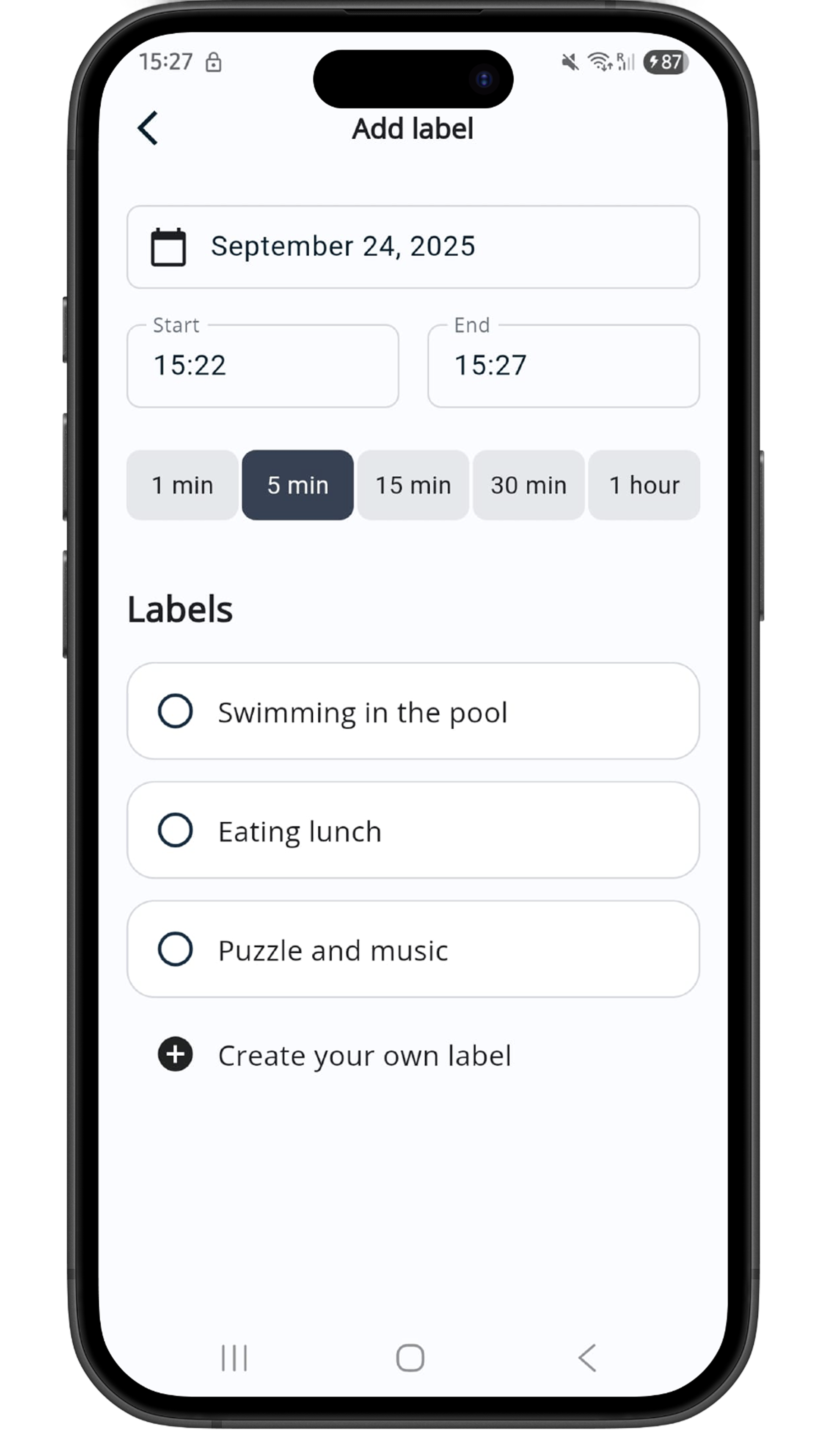 |
Part 2: Analyse labels
For a reliable analysis, ensure each label is applied at least 5 times. The more entries, the more accurate the results.
Use case A: Analyse predefined labels
Select the predefined label you want to analyse from the menu at the top left corner of the chart. 👉 On each row, you can see how many times each label has been applied. The more labels, the better insights. .gif?inst-v=174e8e58-dac9-4992-879c-00705ffc81b9) | |
2 | When analysing, focus on:
👉 Sometimes, if the stress level during is lower, it may indicate that the client is using that activity as a coping mechanism (signal behaviour). |
Use case B: Analyse a custom selection of labels
You can analyse custom groups of labels (that are not in predefined labels).
Select a custom group of labels by clicking on the menu at the top left corner of the chart, then click on “See all labels“. .gif?inst-v=174e8e58-dac9-4992-879c-00705ffc81b9) | |
2 | When the table with all labels opens, you can select multiple labels that you want to analyse together. .👉 You can use the search bar to find labels more easily and/or give this label group a title from the top left corner. 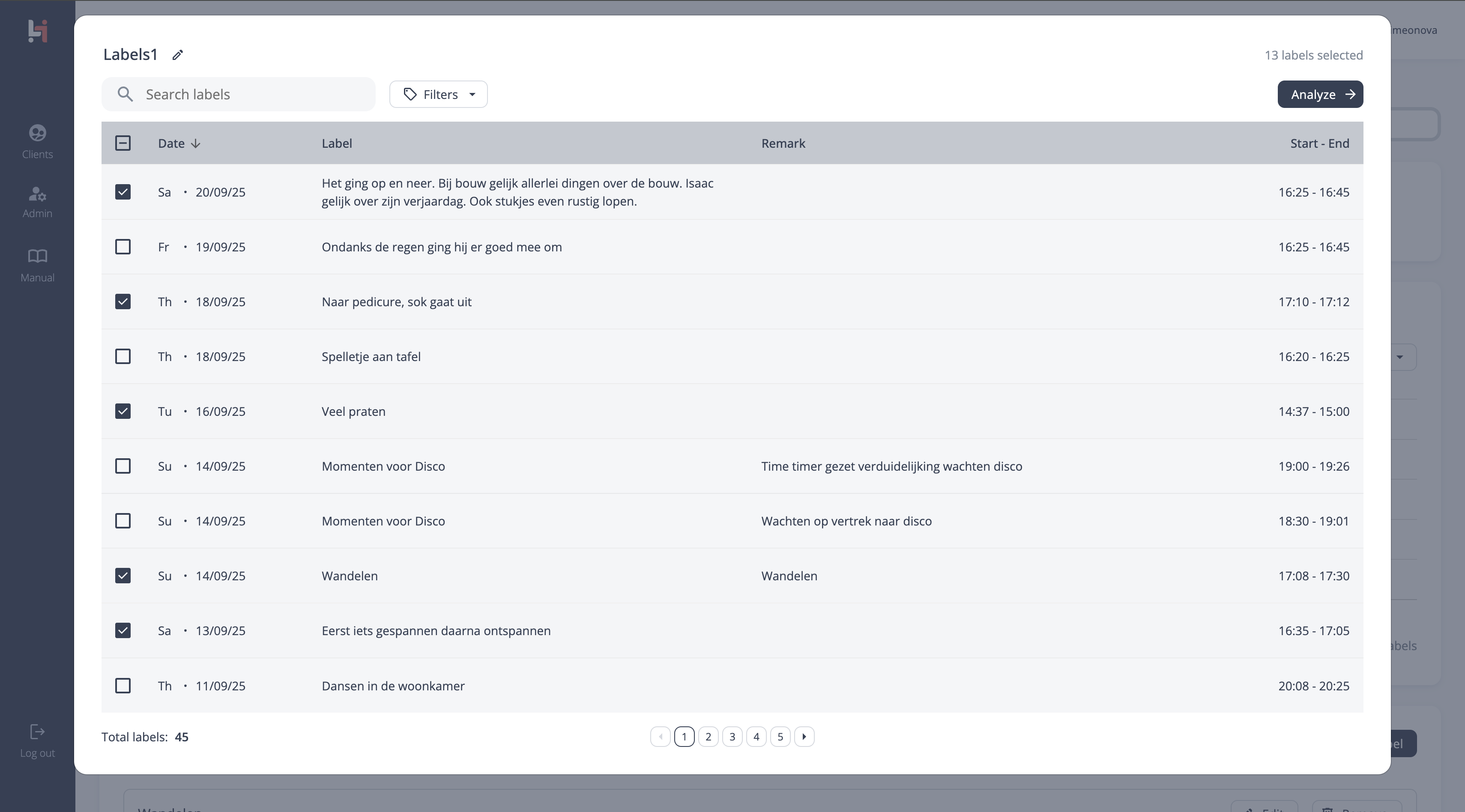 |
Use case C: Compare label groups
It’s good practice to compare labels of the same type—interventions with interventions, and behaviours with behaviours.
For example: walking vs eating, or screaming vs hitting.
To select a second group of labels, use the button “+ Compare“ above the chart. This will open a new selection menu with your predefined labels. 👉 You can compare up to 5 label groups at once. 👉 You can also compare predefined with a custom label group. .gif?inst-v=174e8e58-dac9-4992-879c-00705ffc81b9) | |
2. | When comparing, focus on:
👉 Sometimes, if the stress level during is lower, it may indicate that the client is using that activity as a coping mechanism (signal behaviour). |